
Coastal Clear
Tasked with developing a new product concept and designing both primary and secondary packaging for a selected beauty brand. Conduct comprehensive research into the brand’s identity to ensure all designs aligned with its core values and aesthetic. Produce packaging flats and dielines for both components and develope 3D renderings to effectively showcase the final design concept.
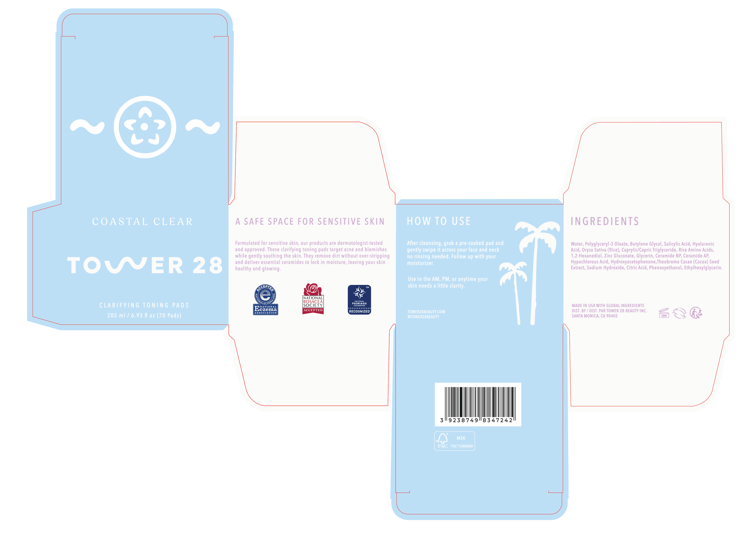
Coastal Clear encapsulates the ocean’s balance of serenity and power through both visual storytelling and product formulation. The product is a clarifying toning pad that targets consumers with sensitive, acne-prone skin, offering safe and effective formulations without sacrificing the experiential joy of skincare, highlighting that all skin types deserve representation.
Researched key market segments to identify opportunities for expanding brand outreach while addressing emerging consumer needs. Identified a white space in Tower 28’s acne treatment category to shape the product concept. Explored the creation of new product logos, expanded the brand’s color story, and developed product names, all unified within a cohesive design direction that remained true to Tower 28’s identity and ethos.
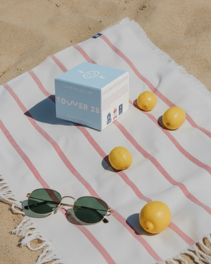
Ensured that the product’s appearance aligned with Tower 28’s fun, friendly design language and copy by incorporating beach-inspired themes, colors, and visuals.
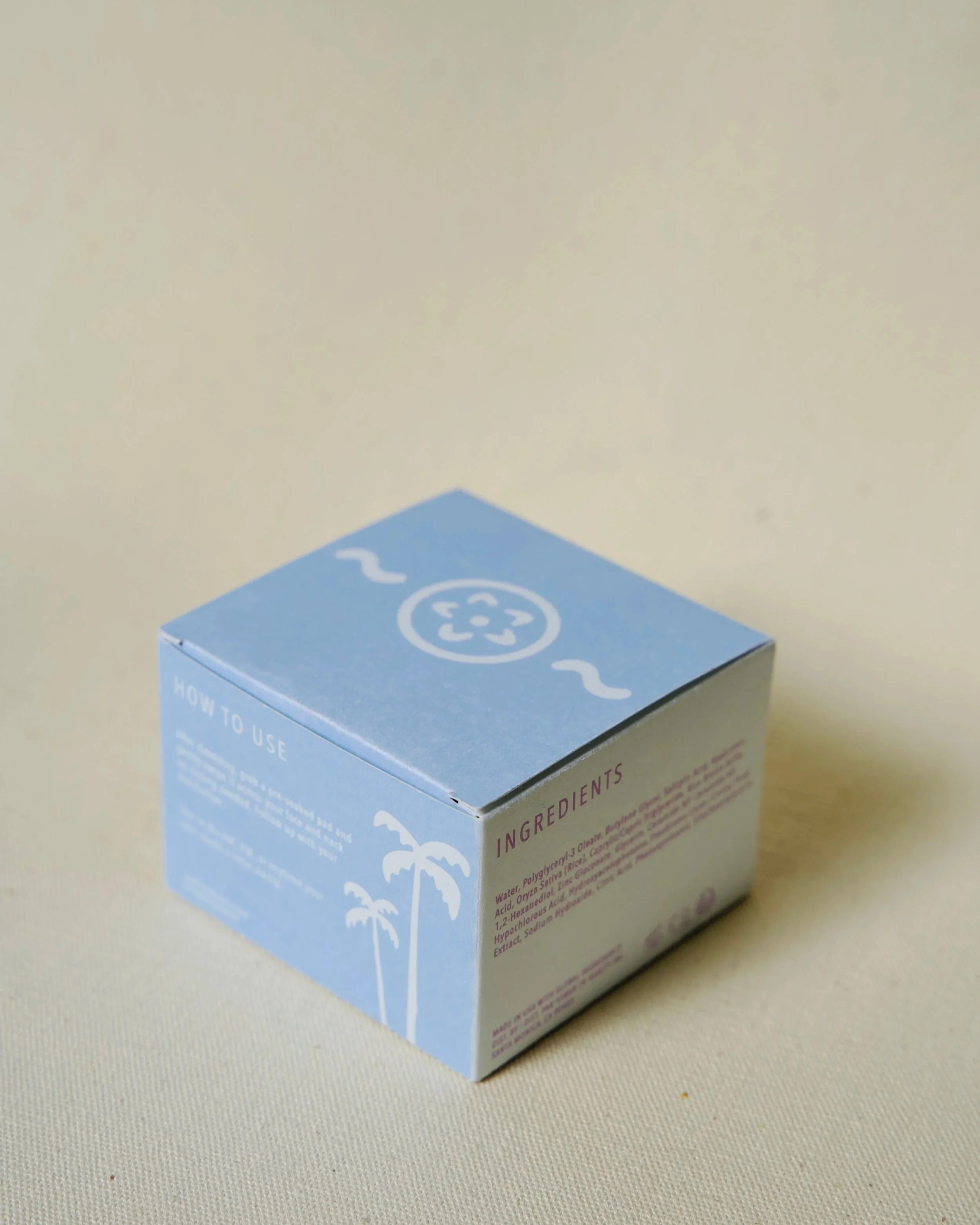
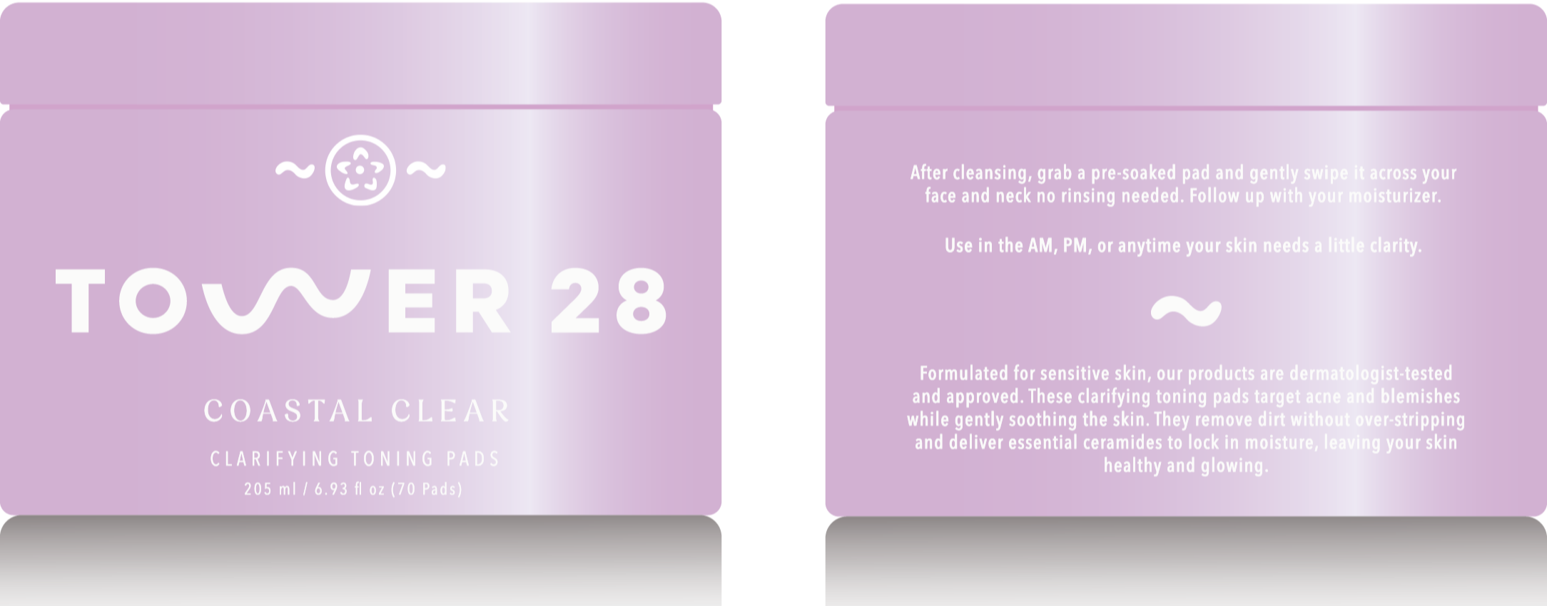
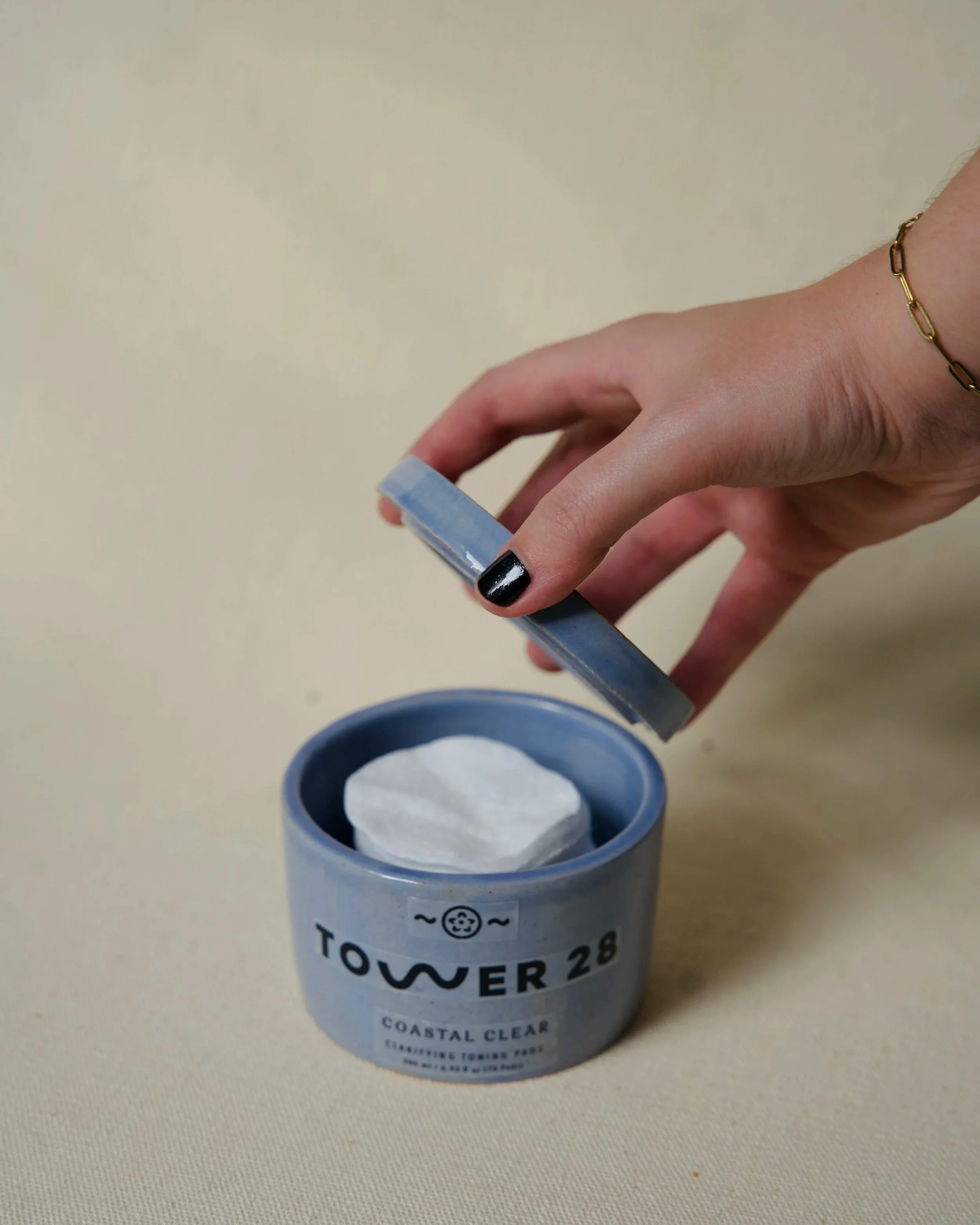
Incorporated elements of mixed media through wheel-thrown ceramics and printed dielines to give the product real-world context, showcasing how it would appear on the shelf.